Wintersemester 2009/10, BA/MA Produkt-Design Produkt_Startseite
Car Sharing | Town Surfing
„Nicht die Dinge, sondern die Organisation der Dinge bestimmt die Qualität des Lebens.“ Bernhard Rudofsky
Mangelnder Komfort verhinderte bisher, dass sich gemeinschaftliche Nutzungskonzepte gegen den individuellen Besitz durchsetzen konnten. Mobile Kommunikationstechnologien eröffnen neue Möglichkeiten, um temporäre Nutzung und individuelle Inbesitznahme zu organisieren. In diesem Projekt wurden Nutzungs- und entsprechende Softwarekonzepte entwickelt, um die persönliche Mobilität auf komfortabelste Weise zu realisieren.
http://www.vimeo.com/12397013
Alle Rechte vorbehalten
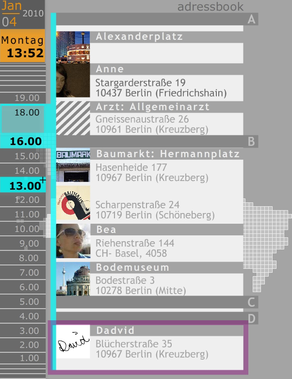
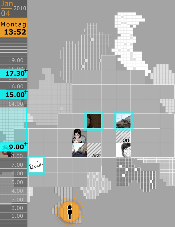
Anika Schultz developed a new way to represent and map locations, rather than using real proportions and distances she proposes a mental map to store and add locations only to the areas of town that the user lives in or travels to. This distorted representation helps to add details to areas of interest and clipping parts of the city that are neglected by the user.
A similar approach is used for the representation of the routes: here only the starting point and the area around the target location are represented with more details, the areas of the travel route that are passed with higher speed are compressed.
The concept of a distorted view is also used in the calendar bar to show a complete day and at the same time enable the user to zoom into every appointment
Alle Rechte vorbehalten
http://vimeo.com/12347213
http://vimeo.com/12356968
Alle Rechte vorbehalten
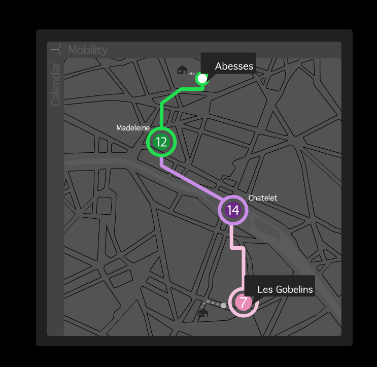
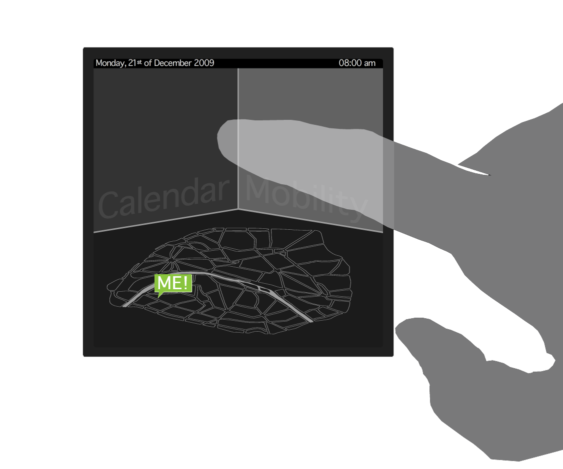
Anouk Hoffmeister developed a threedimensional model to decribe the relationship between location and time. The third plane is used to highlight all information concering the users mobility and
schedule, like notifications about the schedule, routes, etc...
In this concept the time axis is running downwards, disappearing towards the horizon of the plane of the map. This direction allows to visualize appointments as bubbles above the location they are
planned to take place.
The user can easily switch between the three planes by tilting the device in the directions of the plane he or she wants to see next.
When planning an appointment the information is linked to the address book, the calendar and the map thus trying to reduce the input effort for the user to a minimum.
Alle Rechte vorbehalten
http://vimeo.com/10974862
Alle Rechte vorbehalten
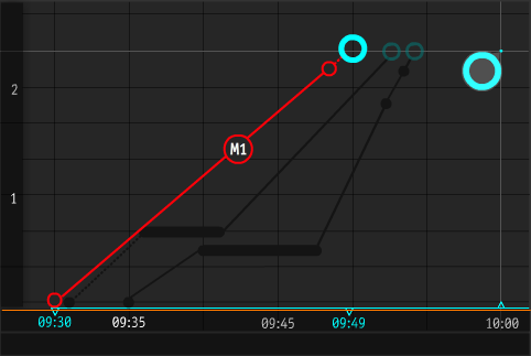
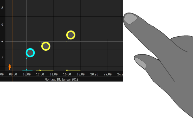
Christina Ebert developed a matrix that allows for a combined view of time (x axis) and distance (Y axis). So each appointment is placed on this matrix according to its time and its distance to the previous appointment. All means of transportation map themselves between two locations indicating by the slope how fast they are: the steaper the slope the faster.
The users can also see immediately what alternative routes are available and how many transfers on each route are neccessary.
The time passing by and the current location of the user is indicated by an animated „mini-me“. This view can be morphed into a time table / calendar view by tilting the screen to portrait. By tilting the screen to the horizontal a geographic map view becomes visible.
Alle Rechte vorbehalten
Alle Rechte vorbehalten
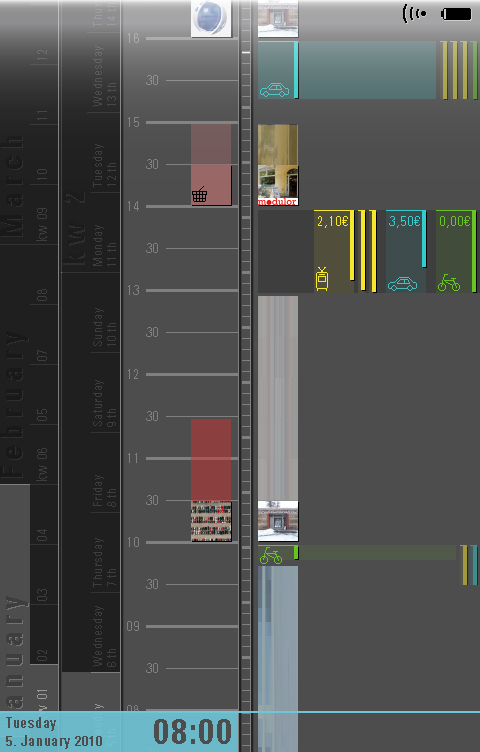
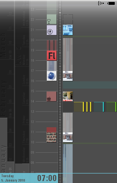
Rebekka Lauer developed a concept that is radically based on time. Like on a linear clock were years, months, weeks, hours and minutes are linked in a virtual transmission all appointments, routes and
means of transportation are heading against a here+now needle thus indicating the time left for e.g. taking or switching the bus.
Beside the appointments that are represented by two icons („what“ and „where“) also travel times are showing up on this linear clock helping to plan the commute between two locations. The length of the travel time stripe is defined by the means of transportation that can be chosen and modified at any time.
The effective screen size can be enlarged by sliding the linear clock to the left thus creating more space for the route planning details.
Alle Rechte vorbehalten