Wintersemester 2023/2024, BA/MA Visuelle Kommunikation VK_Startseite
✎ · kabel abstractions, 2024
Reading a text is a sublime experience, but can a text become an image?
This research goes through creating a visual verbal approach and goes into turning the alphabet into something evocative.
The inspiration for this exploration happened during an immersive study at the Staatsbibliothek
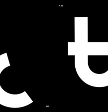
Berlin, where the font Kabel, made by Rudolf Koch in 1927, captured my attention. Intrigued by its classical sans-serif nature, I decided to concentrate on the Kabel font for its simplicity, readability, and timeless design. However, my intention was not to replicate its characteristics but rather to infuse a sense of controlled chaos and playfulness.
The initial phase involved a study of the original Kabel font, unraveling its unique characteristics, proportions, and stylistic elements. Analyzing the details and nuances of the typeface provided valuable insights into the fundamental structure of letters. This understanding became the canvas on which I would unleash creativity, seeking to redefine the conventional expectations associated with letterforms.
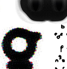
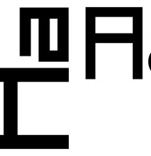
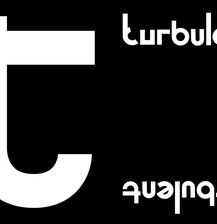
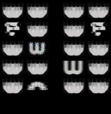
I aimed to inject a sense of dynamism into my font. The goal was to disrupt the orderly flow of letters, introducing a playful disarray while maintaining a visual coherence that engages the reader. As I delved into the design process, experimenting with each letter, I found joy in breaking free from the conventional constraints. Embracing asymmetry, unconventional shapes, and unexpected combinations, my font evolved into a visual manifestation of controlled entropy.

