Sommersemester 2024, BA/MA Textil- und Material-Design
A Feeling of Colour
A FEELING OF COLOUR – Über den Sinn für und von Farbe
Im Projekt A FEELING OF COLOUR – Über den Sinn für und von Farbe werden wir Farbe nicht nur visuell wahrnehmen, sondern sie auch als physisches, materielles und kulturelles Phänomen betrachten. Wir werden Farbe und ihre Wirkung sowohl in der Gestaltung ästhetischer Formen als auch in sozialen Strukturen, im historischen und kulturellen Kontext untersuchen.
Den Ausgangspunkt jedes Projekts bildet eine bestimmte Farbe. Auf die persönliche Interpretation und Wahrnehmung wird eine umfangreiche Recherche folgen. Wir werden Farben, ihre Bedeutung, ihr Vorkommen in Kunst und Kultur sowie ihre symbolische, physiologische und gesellschaftspolitische Bedeutung untersuchen.
Ziel des Projekts ist die Schaffung einer frei wählbaren, materialbasierten Arbeit, die auf materieller Ebene, Farbe haptisch und physisch erfahrbar macht und gleichzeitig, auf konzeptioneller Ebene, die Recherche zum jeweiligen Thema reflektiert.
„Falls Farben Formen sind (und nicht Formen haben), und daher, falls Formen Farben sind (nicht haben) …“ – Vilém Flusser
Während der Intuitive Material Studies und des Experimental Workspace werden wir unser intuitives Gespür für Farbe und Komposition schulen und gleichzeitig Farbe über den Sehsinn hinaus verstehen und ihr Potenzial als vielfältigere sinnliche, haptische und taktile Erfahrung erkunden. Im Rahmen des Workshops Reflection and Positioning werden wir die Rolle der Farbe in unserem Arbeitsprozess, und dessen von etablierten Designer*innen und Künstler*innen untersuchen.
–––––
A FEELING OF COLOUR – About the sense for and of colour
Within the project A FEELING OF COLOUR – Über den Sinn für und von Farbe we will perceive color not only visually but also consider it as a physical, material and cultural phenomenon. We will examine colour and its effect both within the creation of aesthetic forms but also in social structures, in historical and cultural context.
The starting point of everyones project will form a certain colour. The personal interpretation and perception of it, will be followed by a broad research. We will explore colour, their significance and occurrence within arts and culture, its symbolic, physiological and sociopolitical meaning.
The aim of the project will be the creation of a freely definable, material-based work that, on a material level, makes colour haptically und physically tangible und at the same time, on a conceptual level, reflects the research about the respective.
„If colours are shapes (and do not have shapes), and therefore if shapes are colours (do not have)…“ – Vilém Flusser
During the Intuitive Material Studies and the Experimental Workspace we will train our intuitive feeling for colour and composition while also, understand colour beyond the sense of sight exploring its potential as a more diversified sensual, haptical and tactile experience. In the course of the workshop Reflection and Positioning we will investigate the role of colour within our working process and the ones of established designers and artists.
Project categorySemester Project Project subjects BA/MA Textil- und Material-Design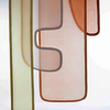
Bitte Lizenz eintragen!
When one looks at the sun and closes their eyes, they intuitively continue to perceive a warm color. My work playfully engages with findings from environmental psychology, which demonstrate that the color of light in a room influences a person’s affective impressions.
The project aims to enable viewers to interactively experience colors, shapes, and light moods and to create an individual composition based on that experience.
Keine Lizenz Marieke Niemann
Bitte Lizenz eintragen!
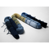
Blue is considered the most common color in nature that can convey calm and relaxation. My object was inspired by the color blue. It is intended to promote inner peace and mental balance by reflecting the calming qualities of nature.
The soft textile object is a mat and meditation cushion. It can be folded or rolled as desired. Lavender flowers were used as filling material, which can calm the nerves and stabilize the mood with their herbaceous scent.
In addition, my object is concerned with combining intuitively knitted textiles with work on the loom in order to combine two different craft techniques.
Keine Lizenz Eunpyo Lee
Bitte Lizenz eintragen!
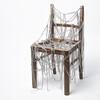
RECHAIR is an activist design concept that explores repair as a
method of design, focusing on the perceived value of everyday
objects. By using old, broken chairs as a starting point, it
challenges the notion of use and value through modification.
Inspired by Kintsugi, RECHAIR elevates the old and broken by
adding high-quality materials or special techniques, transforming
them into unique „chair creatures.“ The goal is not merely to
restore functionality, but to remove the stigma of brokenness,
fictionalizing the history of these objects and inviting viewers to
reimagine everyday items.
Keine Lizenz Jola Hauschild
Bitte Lizenz eintragen!
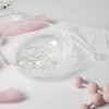
This is what pink feels like to me: soft, light, fragile, sticky, smooth and foamy. In this project, I sought to make my associations with this color tangible, in the form of a pink tablescape. Ordinary mealtime conventions and familiar taste perceptions are dissolved here through the use of the table utensils I have desig- ned and derived from the color. This synaesthetic representation of pink plays with expectations of the color, creating a connection and interaction between otherwise contrasting materials.
Keine Lizenz Theresa Schiebel
Bitte Lizenz eintragen!
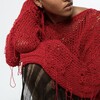
Mistakes are burdened with stigma. As a society, we determine what is right and what is wrong. Our understanding of these concepts fluidly changes with societal norms. The project „Fehlerfreiheit,“ plays with mistakes that can occur in the process of knitting or in the use of knitted garments.
The developed collection includes five pieces of clothing that can be freely combined: a sweater, a long sleeve, pants, a dress, and a vest. Each of these pieces incorporates a specific mistake applied to the entire garment – pulled threads, felted areas, open seams, dropped stitches, or accidentally knitted holes.
This results in surfaces and structures marked by mistakes, bringing with them a unique design potential.
Keine Lizenz Matilda Kindima Bah
Bitte Lizenz eintragen!
Depression can change you in many ways. It affects various aspects of the senses,
including the perception of colour. Research has shown that individuals suffering
from depression often perceive colours as less vibrant and more muted. Luckily this
change in perception is not irreversible, people who won their battle with the illness
often report seeing the world shine in its „true colours“ again.
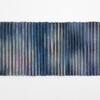
„Feeling Blue-ish“ aims to visualise this phenomenon and encourage people to view
the world through different eyes. The double-layered textile is woven in stripes of two
alternating images. The pleats create a lenticular effect, changing the visibility of the
images depending on the viewer‘s perspective - signifying the shift in perception that
is imperative to recovery.
Keine Lizenz Luna Portmann
Bitte Lizenz eintragen!
Beige, an inconspicuous, almost invisible color, only used when the others should not be.
If you don’t bleach natural fabrics, if you decide against white or colors, the beige remains.
A dirty white of nature.
When flowers wither and their color fades, they are replaced by beige.
Perhaps beige is the true non-color. The color that remains.
It symbolizes transience even better than black.
The flowers that remain only in beige after they have withered.
At the end of which there is also inevitably the dissolution of form.
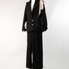
If you transfer this content to fashion, a suit is also created piece by piece, blossoms and eventually
disintegrates.
Withers from the top down. It loses its form until at some point only the framework, the stem,
retains its final shape.
Keine Lizenz Marina Luding